Tuesday, January 27, 2009

Type 2 - Journal 2

Stay up late.
Strange things happen when you've gone too far, been up too long, worked too hard, and you're separated form the rest of the world. (18)



Bruce Mau is the creative director of Bruce Mau Design (BMD) and the founder of the Institute without Boundaries. His studio has gained recognition for its expertise and innovation in identity articulation, research and conceptual programming, print design and production, environmental signage and way finding systems, and exhibition and product design.

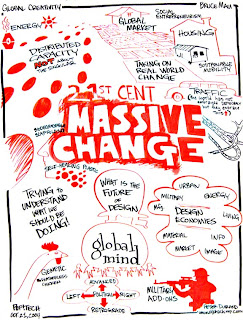
Mau recently worked on a project called "Massive Change: the Future of Design Culture" with the Institute without Boundaries. It was an international project that mapped the capacity, power and promise of design. Massive Change explored paradigm-shifting events and ideas, investigated the capacities and ethnical dilemmas of design in manufacturing, transportation, urbanism, trade, warfare, health, energy, materials, the image, information and software. The exhibition lasted 3 months in the Vancouver Art Gallery and traveled afterwards. "Massive Change" has also inspired a book, weekly electronic newsletter and radio broadcast.

Tuesday, January 20, 2009

Type 2 - Journal 1

Chip Kidd is an author and graphic designer. In 2007 he was awarded the Cooper-Hewitt National Design Award for one of his book covers. He is important because he has created over 1,000 innovative book covers. He designs book covers that look good, as well as have a mass appeal.


John Gall is the Art Director for Vintage and Anchor Books, a publishing group within Random House. He uses simple, but elegant typography on his book covers. He uses collages, photos, typography and art in many of his book covers, which are unique from the many other books on the shelf.


The title of Confessions of a Shopaholic is written on a price tag, a reference to shopping.


The cover of How to Talk to Girls is all typography except for the heart that is encompassed by a speech bubble. This gives the impression that the book is about how to find love. 


On the bottom of the cover of Flat Belly Diet there is a tape measure. This is an index of weightloss, which the book will be about.


Series - A sequence of books that share common characteristics and are identified as a group. Harry Potter is an example of a series.

Sequence - An ordered list of objects or events. The order in which a series of books is meant to be read.

A sign can be identified as 1 of 3 categories: icon, index or symbol. Each relates to their object in a different way; icons have specific properties in common with their objects, indexes are directly influenced by their objects and symbols have a convention-based relationships with their objects.

An icon is a pattern that physically resembles what it stands for. Such as the symbol of the woman and man that represent the restroom.
An index either correlates with or points to something. For example a dog bone would reference a dog.
Symbols can either be categorized as word symbols or nonword symbols. Word symbols such as the word peace, are usually just the word. While nonword symbols are a picture that represents a word, such as the dove, which represents peace.

Graphic Design - Reading 1

Symbols can represent a variety of different things, such as the apple we looked at. One person could say it means health, while another says temptation. All of the different ways a symbol can be interpreted should be looked at and considered because you wouldn't want anyone to badly interpret your message. Also a lot of times you don't need the whole picture to get the same point across. Just by showing Elvis' different haircuts you can tell what is being represented. Always remember to simplify! 

There are so many different things to think about before designing a logo, a lot more goes into it than I thought. It's not just putting something together that looks good; you have to consider it from every viewpoint. 

Thursday, September 25, 2008

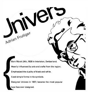
Who is Adrian Frutiger?

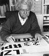
Adrian Frutiger is a well known type designer, having produced some of the most used and widely known fonts. He studied at the Zurich School of Arts and Crafts after working as a printer's apprentice at the age of 16. 
After school Frutiger moved to Paris to work at the Deberny & Peignot typefoundry, where he helped move classic typeface used with traditional printing methods to newer phototypesetting technologies. This is also when Frutiger started designing his own typefaces.
In 1956 Frutiger designed the Univers typeface and it was released the following year. 
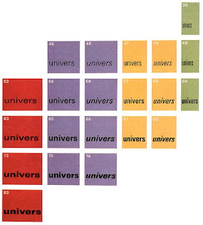
Univers “is a neo-grotesque san-serif; it features optically even stroke weights and a large x-height to improve legibility. It's become known for the variety of weights and set-widths included in the family. At the time it was designed it included 21 variations, and was the first type family to implement a numbering system as opposed to using names. Today there are over 27 different variations of Univers available. Univers is an extremely diverse typeface that has the ability to work very well at large display sizes for applications such as headlines and mastheads as well as in small sizes for body copy.”
In 1990 Frutiger expanded Univers with the help of Linotype to include 63 different weights, which were each carefully drawn so they would be compatible with all the others.
All these variations of the Univers typeface can be seen in the Univers grid, which shows how each variation is slightly different from the previous one.


Sources:

Wednesday, September 24, 2008

Who is John Baskerville?


John Baskerville is best known as a printer and typographer. He was very interested in the shapes of letter forms, which led him to design and manufacture his own typeface for the printing press. He printed many books, including Milton's Paradise Lost and Paradise Regained, Political Songster by John Freeth and a pocket dictionary. However, the Bible he printed in 1763 is regarded as his masterpiece, which is somewhat ironic since Baskerville was an atheist. 
Baskerville's printings are known for being clear and carefully done. They are considered among the best examples of art printing. 
Baskerville was a printer for Cambridge University from 1758-68. He also created the Baskerville font, which is still used today because of it's clarity and balance.
Baskerville is a traditional typeface. “...with its generous proportions, the Baskerville appears not very different from its predecessors. But the difference between fine and bold strokes is more marked, the lower-case serifs are almost horizontal and the emphasis on the stroke widths is almost vertical.”

Today there is a monument dedicated to John Baskerville in Birmingham, by the Baskerville House, where Baskerville once lived and worked. Columns of stone display reversed letters, which spell out “Virgil,” his very first work in 1757. The monument is known as “Industry and Genius,” which comes from a poem which praised Baskerville.


Sources:

Who is Paul Rand?

Although Paul Rand died over 10 years ago, he is still a widely known and respected graphic designer. Rand was best known for his corporate logo designs, many of which are still in use today. Rand designed many famous corporate logos for companies such as the ones in the picture below.
The IBM logo was Rand's defining corporate identity. Rand modified the logo in 1960 and then again in 1972.
The Original IBM logo before Rand's modifications.

Rand's first IBM logo.

Rand's second IBM logo. The stripes are used to suggest “speed and dynamism.”

Rand not only designed IBM's logo, but designed packaging and marketing materials for them as well, including the famous “Eye-Bee-M” poster seen below. 
Although Rand's most famous corporate identity that he designed was for IBM, it was not his first. Paul Rand was born Peretz Rosenbaum, but later changed his name to try to cover up his Jewish identity. Peter Behrens 
noticed the importance of Rand's new name, saying, “Rand’s new persona, which served as the brand name for his many accomplishments, was the first corporate identity he created.”

Rand attended such schools as the Pratt Institute, the Parsons School of Design and the Art Students League, yet he felt unstimulated and began teaching himself. Rand studied the works of Cassandre and Moholy-Nagy from European magazines. Rand later taught design at Yale University and was inducted into the New York Art Directors Club Hall of Fame in 1972. Rand was also one of the originators of the Swiss Style of graphic design.


Sources: