Tuesday, January 27, 2009

Type 2 - Journal 2

Stay up late.
Strange things happen when you've gone too far, been up too long, worked too hard, and you're separated form the rest of the world. (18)


Bruce Mau is the creative director of Bruce Mau Design (BMD) and the founder of the Institute without Boundaries. His studio has gained recognition for its expertise and innovation in identity articulation, research and conceptual programming, print design and production, environmental signage and way finding systems, and exhibition and product design.

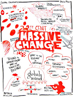
Mau recently worked on a project called "Massive Change: the Future of Design Culture" with the Institute without Boundaries. It was an international project that mapped the capacity, power and promise of design. Massive Change explored paradigm-shifting events and ideas, investigated the capacities and ethnical dilemmas of design in manufacturing, transportation, urbanism, trade, warfare, health, energy, materials, the image, information and software. The exhibition lasted 3 months in the Vancouver Art Gallery and traveled afterwards. "Massive Change" has also inspired a book, weekly electronic newsletter and radio broadcast.

Tuesday, January 20, 2009

Type 2 - Journal 1

Chip Kidd is an author and graphic designer. In 2007 he was awarded the Cooper-Hewitt National Design Award for one of his book covers. He is important because he has created over 1,000 innovative book covers. He designs book covers that look good, as well as have a mass appeal.


John Gall is the Art Director for Vintage and Anchor Books, a publishing group within Random House. He uses simple, but elegant typography on his book covers. He uses collages, photos, typography and art in many of his book covers, which are unique from the many other books on the shelf.


The title of Confessions of a Shopaholic is written on a price tag, a reference to shopping.


The cover of How to Talk to Girls is all typography except for the heart that is encompassed by a speech bubble. This gives the impression that the book is about how to find love. 


On the bottom of the cover of Flat Belly Diet there is a tape measure. This is an index of weightloss, which the book will be about.


Series - A sequence of books that share common characteristics and are identified as a group. Harry Potter is an example of a series.

Sequence - An ordered list of objects or events. The order in which a series of books is meant to be read.

A sign can be identified as 1 of 3 categories: icon, index or symbol. Each relates to their object in a different way; icons have specific properties in common with their objects, indexes are directly influenced by their objects and symbols have a convention-based relationships with their objects.

An icon is a pattern that physically resembles what it stands for. Such as the symbol of the woman and man that represent the restroom.
An index either correlates with or points to something. For example a dog bone would reference a dog.
Symbols can either be categorized as word symbols or nonword symbols. Word symbols such as the word peace, are usually just the word. While nonword symbols are a picture that represents a word, such as the dove, which represents peace.

Graphic Design - Reading 1

Symbols can represent a variety of different things, such as the apple we looked at. One person could say it means health, while another says temptation. All of the different ways a symbol can be interpreted should be looked at and considered because you wouldn't want anyone to badly interpret your message. Also a lot of times you don't need the whole picture to get the same point across. Just by showing Elvis' different haircuts you can tell what is being represented. Always remember to simplify! 

There are so many different things to think about before designing a logo, a lot more goes into it than I thought. It's not just putting something together that looks good; you have to consider it from every viewpoint.