Thursday, December 10, 2009
Monday, December 7, 2009

Monday, November 16, 2009

Thursday, November 5, 2009
Great minds think alike
So I'm not sure if it's just because I was working with texting while driving for 2 projects that I've suddenly noticed all this texting while driving stuff or if it's just an increasing issue...probably a mixture of the two.


Trollback + Company
So a couple weeks ago Jakob Trollback came and spoke at the Hallmark Symposium. I thought he was very interesting, one of the better speakers for sure. Also his work was amazing!! You can check out a lot of his work on the Trollback + Co. website. Clicking through and watching his work at the lecture I realized I had seen a lot of his work before. It was so cool to listen to a designer that had stuff that I had actually seen.
Some things on the website that I especially liked were the Hippies video for the History Channel and video for the World Science Festival.
Some things on the website that I especially liked were the Hippies video for the History Channel and video for the World Science Festival.
Tuesday, November 3, 2009


Thursday, October 15, 2009
Wednesday, October 7, 2009


Tuesday, September 29, 2009
Project 1 Website
The Toy Store
Here is my website for The Toy Store!
Just in case...
http://people.ku.edu/~allieb/the_toy_store/splash.html
Here is my website for The Toy Store!
Just in case...
http://people.ku.edu/~allieb/the_toy_store/splash.html
Thursday, September 24, 2009
Inspiring blog & quotes
Ran across this blog today...
design wonderland
...pretty inspiring stuff. The blogger also had some quotes I really liked on her blog as well...
"Let the beauty of what you love be what you do." - Rumi
...and...
"I am going to make everything around me beautiful. That will be my life." - Elsie de Wolfe
design wonderland
...pretty inspiring stuff. The blogger also had some quotes I really liked on her blog as well...
"Let the beauty of what you love be what you do." - Rumi
...and...
"I am going to make everything around me beautiful. That will be my life." - Elsie de Wolfe
Wednesday, September 23, 2009
Guess the Logo
Guess the Logo
Found this cool site today. Pretty fun, the TV logos were the easiest for me. Car logos and the web logos 2 were pretty hard.
Found this cool site today. Pretty fun, the TV logos were the easiest for me. Car logos and the web logos 2 were pretty hard.
Tuesday, September 15, 2009
Toy Store Sites
So while creating my website for The Toy Store, I thought I should take a look at other toy store websites.
FAO Schwarz
This one is well designed and easily navigable, adults or kids could easily click through the site. You can't do a whole lot on the site except learn about the store, but the way they have that all set up is nice.
Toys R Us
Set up well for a big company that sells a lot online. The Toy Store couldn't really benefit from this kind of design because it is such a smaller company, however, I'm sure there are ways this site could inspire mine.
Wooden Horse Toys
This site is set up pretty much exactly like The Toy Store. It's a little better designed, but is still pretty confusing and not easily navigable. I do like their "Best sellers" and "What's new" categories though.
Saturday, September 12, 2009
Creative Ads
http://www.designer-daily.com/50-brilliant-creative-advertisements-for-your-inspiration-3169
Came across this website today. Love all the ads, so creative. Here are a few that I thought were exceptional...


Came across this website today. Love all the ads, so creative. Here are a few that I thought were exceptional...


Wednesday, September 2, 2009
Logo trends and interesting observation.
I stumbled across this article today on LogoLounge about current trends in logos. Kind of interesting. I really like the concealed logo trend... definitely show that special wink.
Also while working on my project for Type I came across another website that desperately needs redesigned: NHTSA Thought it was kind of funny that we're redesigning websites in graphics and the organization for my type project could benefit.
Also while working on my project for Type I came across another website that desperately needs redesigned: NHTSA Thought it was kind of funny that we're redesigning websites in graphics and the organization for my type project could benefit.
Tuesday, April 21, 2009
Type 2 - Journal 13
I found the presentation, Larry Lessig: How creativity is being strangle by the law, very interesting. It was both insightful, as well as humorous. The issue of copyright vs. creativity is one that it very important. I can see why artists would want their work to be copyrighted, but I can also see how other people could use anothers work creatively to make something of their own. I think that Lessig's idea of balancing the two extremes by making work available more freely for non-commercial use. This idea would be successful because as long as you are not profiting from your use of another's work you should be able to use it for your own enjoyment (and the enjoyment of others). By using a popular song and setting it to images you are creating something uniquly your own, and are not doing any harm. The harm comes from using the popular song to profit without paying the creator their dues. Lessig's idea will encourage creativity of the youth, as well as protect the original creators work...and it sounds like a great idea to me.
Monday, April 20, 2009
Type 2 - "Final" video
Here's my "final" version. I'm thinking of adding the speech name and speaker to the beginning or made at the end. Perhaps the date Robert F. Kennedy was shot at the beginning? I think it needs something there. Let me know what you think...and anything else you have comments on. Thanks!
Thursday, April 16, 2009
Eulogy for Robert F Kennedy
Here's my video... I have the whole speech in there except for the last sentence. My audio messes up when it gets to that point so I've been working on fixing it, but not having any luck so far, but any suggestions on what I have so far would be much appreciated. =)
Thursday, March 26, 2009
Type 2 - Questions over Speech
My brother need not be idealized, or enlarged in death beyond what he was in life; to be remembered simply as a good and decent man, who saw wrong and tried to right it, saw suffering and tried to heal it, saw war and tried to stop it.
Those of us who loved him and who take him to his rest today, pray that what he was to us and what he wished for others will some day come to pass for all the world.
As he said many times, in many parts of this nation, to those he touched and who sought to touch him:
"Some men see things as they are and say why.
I dream things that never were and say why not."
Spoken by Edward M. Kennedy
This speech is important because it was to console the world as we said goodbye to Robert F. Kennedy. I find it interesting because it tells about who Robert F. Kennedy was and what he tried to do during his lifetime.
There is a lot of emotion in this speech because it was given at the service for Robert F. Kennedy by his brother. The tone is somber.
Words that could be emphasized are death, life, good and decent, wrong, right, suffering, heal, war, stop, loved, pray, wish, all the world, touched, why, why not.
It is a sad speech because we lost a great man, but it is also inspiring. It makes people want to live like Robert F. Kennedy and be the kind of person that he was.
Edward M. Kennedy is the youngest of nine children of Joseph P. Kennedy and Rose Fitzgerald Kennedy, and is a graduate of Harvard University and the University of Virginia Law School. Kennedy lives in Hyannis Port, Massachusetts, with his wife Victoria Reggie Kennedy. Together, they have five children – Kara, Edward Jr., and Patrick Kennedy, and Curran and Caroline Raclin. They also have four grandchildren. Kennedy is currently the Chairman on the Health, Education, Labor and Pensions Committee in the Senate. He also serves on the Armed Services Committee where he is the senior Democrat on the Seapower Subcommittee. He is also a member of the Congressional Joint Economic Committee and the Congressional Friends of Ireland, and a trustee of the John F. Kennedy Center for the Performing Arts in Washington, D.C. Senator Edward M. Kennedy has represented Massachusetts in the United States Senate for forty-six years. He was elected in 1962 to finish the final two years of the Senate term of his brother, Senator John F. Kennedy, who was elected President in 1960. Since then, Kennedy has been re-elected to seven full terms, and is now the second most senior member of the Senate. Throughout his career, Kennedy has fought for issues that benefit the citizens of Massachusetts and the nation. His effort to make quality health care accessible and affordable to every American is a battle that Kennedy has been waging ever since he arrived in the Senate. In addition, Kennedy is active on a wide range of other issues, including education reform and immigration reform, raising the minimum wage, defending the rights of workers and their families, strengthening civil rights, assisting individuals with disabilities, fighting for cleaner water and cleaner air, and protecting and strengthening Social Security and Medicare.
Sources:
Monday, March 2, 2009
Tuesday, February 24, 2009
Type 2 - Journal 6
Being a good writer can help you become a better designer and being a good designer can produce better writing. The two go hand in hand having many things in common, such as brainstorming, research, organization, roughs, revisions, etc. Yet, so often we seem to separate the two. We should try to see them more as a whole than two separate pieces. By being a good writer, a designer can better communicate their ideas and by being a good designer a writer can communicate to a specific audience in a specific way. This makes both products better in the end.
Links:
The Role of Writing in a Design Curriculum
Better Writing Through Design
Brand New
Links:
The Role of Writing in a Design Curriculum
Better Writing Through Design
Brand New
Monday, February 9, 2009
Type 2 - Journal 4
In the video of Stefan Sagmeister's presentation Yes, design can make you happy he spoke about things in his life that have made him happy, mostly about the ones that had to do with design. He also spoke about other people's designs that made him happy. I really enjoyed the designs made by other people that he showed. The subway signs were very interesting because they could easily go unnoticed. I wonder how many people notice them and how many do not? I like projects like that because if you do notice them, they can easily brighten your day. Also the speech bubble project was interesting because it let the viewers be a part of the project. I often enjoy projects where the viewer is a participant, like in the PostSecret project for example.
I also watched J.J. Abrams' talk, The mystery box. He talked about why mysteries are interesting to him and how that came about. He showed a lot of interesting clips from his projects as well as others. When he showed the Kleenex box that he had disassembled I found it really interesting. I never thought of all the work that goes into making something as simple as a box for Kleenex. I also really liked the whole theme of his talk, which sprang from the magic box his grandpa bought for as a kid and he has never opened.
The last video I watched was the presentation Fashion, passion, and about a million other things by Isaac Mizrahi. His talk was very intruiging and quite funny. It was interesting to learn that he stays up late and feels like that's when he comes up with his best ideas. Also it was interesting, and funny, when he spoke about following people that he finds interesting and going to Tarot card readers to find new ideas. Mizrahi said he was greatly inspired by color and amusing mistakes.
I picked these videos not only because they were recommended, but also because they were some of the few people that I had heard of on the site. Although, I'm sure many more of the talks were also good.
How Good is Good?
I think it's really fascinating that design can make people feel all those different things. The design doesn't even have to be different to evoke these different emotions. Two different people could feel two very different things while looking at the exact same design.
The Ten Commandments of Typography & How to Break Them
The Ten Commandments:
- Thou shalt not apply more than three typefaces in a document.
- Thou shalt lay headlines large and at the top of a page.
- Thou shalt employ no other type size than 8pt to 10 pt for body copy.
- Remember that a typeface that is not legible is not truly a typeface.
- Honour thy kerning, so that white space becomes visually equalized between characters.
- Thou shalt lay stress discreetly upon elements within text.
- Thou shalt not use only capitals when setting vast body copy.
- Thou shalt always align letters and words on a baseline.
- Thou shalt use flush-left, ragged-right type alignment.
- Thou shalt not make lines too short or too long.
- Break the fetters imposed by the use of only three typefaces.
- Let thine eyes be seduced by the hierarchy of type.
- Do not forsake smaller of bigger sizes.
- Be seduced into trying new and expressive typefaces.
- Treat kerning and tracking with total irreverence.
- Entice the reader to sample the delights of your text.
- Do not forgo the liberal use of capitals within your text.
- The Lord designed letterforms to stand side by side, but there is no harm in their being lured away from one another.
- Yield to the temptation to align text in unusual ways.
- Lure the reader down unfamiliar paths.
Tuesday, January 27, 2009
Type 2 - Journal 2
Stay up late.
Strange things happen when you've gone too far, been up too long, worked too hard, and you're separated form the rest of the world. (18)
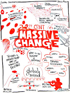
Bruce Mau is the creative director of Bruce Mau Design (BMD) and the founder of the Institute without Boundaries. His studio has gained recognition for its expertise and innovation in identity articulation, research and conceptual programming, print design and production, environmental signage and way finding systems, and exhibition and product design.
Mau recently worked on a project called "Massive Change: the Future of Design Culture" with the Institute without Boundaries. It was an international project that mapped the capacity, power and promise of design. Massive Change explored paradigm-shifting events and ideas, investigated the capacities and ethnical dilemmas of design in manufacturing, transportation, urbanism, trade, warfare, health, energy, materials, the image, information and software. The exhibition lasted 3 months in the Vancouver Art Gallery and traveled afterwards. "Massive Change" has also inspired a book, weekly electronic newsletter and radio broadcast.
Tuesday, January 20, 2009
Type 2 - Journal 1

Chip Kidd is an author and graphic designer. In 2007 he was awarded the Cooper-Hewitt National Design Award for one of his book covers. He is important because he has created over 1,000 innovative book covers. He designs book covers that look good, as well as have a mass appeal.

John Gall is the Art Director for Vintage and Anchor Books, a publishing group within Random House. He uses simple, but elegant typography on his book covers. He uses collages, photos, typography and art in many of his book covers, which are unique from the many other books on the shelf.

The title of Confessions of a Shopaholic is written on a price tag, a reference to shopping.


The cover of How to Talk to Girls is all typography except for the heart that is encompassed by a speech bubble. This gives the impression that the book is about how to find love.


On the bottom of the cover of Flat Belly Diet there is a tape measure. This is an index of weightloss, which the book will be about.


Series - A sequence of books that share common characteristics and are identified as a group. Harry Potter is an example of a series.
Sequence - An ordered list of objects or events. The order in which a series of books is meant to be read.
A sign can be identified as 1 of 3 categories: icon, index or symbol. Each relates to their object in a different way; icons have specific properties in common with their objects, indexes are directly influenced by their objects and symbols have a convention-based relationships with their objects.
An icon is a pattern that physically resembles what it stands for. Such as the symbol of the woman and man that represent the restroom.

An index either correlates with or points to something. For example a dog bone would reference a dog.

Symbols can either be categorized as word symbols or nonword symbols. Word symbols such as the word peace, are usually just the word. While nonword symbols are a picture that represents a word, such as the dove, which represents peace.

Graphic Design - Reading 1
Symbols can represent a variety of different things, such as the apple we looked at. One person could say it means health, while another says temptation. All of the different ways a symbol can be interpreted should be looked at and considered because you wouldn't want anyone to badly interpret your message. Also a lot of times you don't need the whole picture to get the same point across. Just by showing Elvis' different haircuts you can tell what is being represented. Always remember to simplify!
There are so many different things to think about before designing a logo, a lot more goes into it than I thought. It's not just putting something together that looks good; you have to consider it from every viewpoint.
Subscribe to:
Posts (Atom)